D&AD- filter?

I attempted to create a filter for this project yet it does not seem to work well. Mainly because I do not know how to use one but also my colour palette does not seem to work well for this format and should instead be left to printed ephemera rather than this. I feel this does not do my work justice and instead should not be used. It should be rather an idea that I enjoyed and be glad that I avoided due to how it does not fit in with the theme and instead looks out of place. The focus is more on the billboard of the vinyl cover and sleeve and this is what I will instead be highlighting.

snapchat filter 2

snapchat filter


D&AD- Poster/ Billboard

One such issue presented to me in my tutorial was that of the Billboard and how it did not show the idea effectively. The lack of detail caused issues and by decreasing the size of the binary and adding more rows I could in fact heighten the image and what it was trying to portray. The better image through UnSplash meant I also faced no legal issues and the quality of the image could be used more effectively with foreground and skin tones. The added text to show the cause “#Tech.No” was something I thought to be helpful to include as it was a cause that showed nobody wants third party data stealing, or other companies freely selling your data. It also fit well with the music aspect of this project.

billboard binary man 1

billboard binary man trial

project 2- image 4

One such issue I ran into was the use of text over the binary did not suit it well and would be something I would look into should I ever retake this project for whatever reason. I would instead choose a type I could blend into the binary as it would sit better and seem more technological rather than like an advertisement. I am however proud of how this has turned out and how this has all come together and shown itself. This had potential yet my first use of type has caused it to be somewhat ruined in comparison to what it could be.

D&AD- Vinyl fixes

The only thing that required true fixing was the strike throughs in the first part of the vinyl cover sleeve. This now hides more information in proportion to the rest of the text. As well as the large font really separates the text from the coded form of the cover and this makes it much more powerful and with depth. I am fortunate enough not to have to worry about what materials this will be printed on and instead focus more on how It could be best shown. I feel the mock up works well side by side so this should be the format that I would use come the end of the work and showing it towards the tutors.

project 2- image 2

project 2- image 3

The final image consisted of all four parts of the cover using the sleeve in the left hand side with the actual revealed part on the right hand side in order to show how it transitions from A to B. This probably requires more communication but can be something I could fix, come the portfolio part of my project to showcase my work more. I found this to be the better piece of work throughout all my work and found it contained the most intriguing work that had a chance at the competition as well as some character. I feel this would be the best used for any client work for them to see what I am capable of and how in touch I am with printed materials and design briefs.

project 2- Title image

D&AD- David Tutorial

This slideshow requires JavaScript.

Today I had my tutorial in order to improve my work. The idea of changing scale for the “smiley face”, was something that did not work as was better advised to be left alone. The girl was liked but the lack of detail meant she could not be identified as a girl so this was something to fix. Overall the idea were liked but with the notes provided I should use these to take my work forward.

31-03-2020- pres

notes-

Use strike through correctly- cross out harvest, selling it, repeat, accept,

Unsplashed.com

Cut out the section of codes and instead use “thank you for your information”. Mock it up

Not be too nutty gritty- make sure you case is designed and refined. Don’t worry about feasibility.

Use codes over your poster and end with the cause or tags line or whatever you was trying to do.

I found the tutorial to be very helpful towards seeing how my work is to progress as well as how it all fits together. Seeing the use of images become dorky due to the size change and scale really put into perspective how I could not

D&AD- Tutorial

notes-

Speak to Matt if you have tech issues or questions. Look at previous examples and see how it was made or what was presented. A video is the opportunity to tell the story or narrative.

RFID case- redesign one in illustrator instead of mock up if there’s no good one. Maybe watch instead of phone case would be more relevant. Make sure it is explicit. Go one way or the other- steal people data or give them. Chat with Theo about stealing data.  Is the info used to make the woman.

WiFi box so powerful to nick the woman’s data then builds you up.

Try to relate it back to context. Data is information. Comments could be a way forward. Use different weights for the picture using the coding. Steal your feelings-

Needs more typographic- look at systems and coding system

Make carcode smaller- choose colour of line, dark navy and no white background.

Lensstudio- make a filter- what does it say?

Competitions- Hand in

design doc- competitions

Today I uploaded my design document for the competitions brief. This brief was something I felt I had done well in and explored further into than other projects. My understanding of the brief and the cause I was conveying was much more prominent than usual and the whole underlying tones, subtlety and causality was more apparent.

I believe the use of music could however be stronger but the way it was portrayed combined with the pieces and outcomes was something that I would never have thought I was going to attempt when seeing the briefs online.

In my opinion the use of the vinyl covers design while being something someone would probably not buy; is something that works well with colours, type and layout works well but the strike through do not seem to work well as I would have expected, but this may end up being replaced by opacity change instead of a strike through. My Sleeve I thought was unique with the use of the smiley face but perhaps I could have explored it more into possible other areas or even made a logo or icon that my cause was based on, for the most part however it is perfectly acceptable.

The poster linked to modern day issues or social news stories and ideas about hacking or being sued could have been used much more effectively but that is something that could be explored before march.

The “social” idea about charging your phone and the device using your Facebook profile pictures and changing it via code is something that would have to be shown via animation in order to fully show what is meant by it, perhaps additional lines of code to help create a better stronger and more refined image may be an extension of this.

Finally the touch point was probably the best concept I had created, the literal protect your data meets modern applications in an alternate way is something I would not have thought of without the help of tutorials with tutors. The use of a phone case and wallet is something that works well with the younger audiences and works better for those who use techno music or go to gigs where they may be the most digitally vulnerable. The strike through still presents a problem here but this will something to address come before march.

Overall I am happy with my designs and outcomes, while they are still rough around the edges they are more intact than my previous projects and have a lot more value to it, as well as being something that I could gladly put into my portfolio come finishing the year. This will be something I hope to take to the competitions should it receive positive feedback but for now it remains to be probably my best project so far.

Competitions- Final Crit

kierron bennett final crit pres

Today I presented the final group tutorial in which to gain feedback before next week. This consisted of the work I had produced so far in order to know where I sat in terms of outcomes, pace and creativity as well if the cause or message was clear enough.

The vinyl cover sleeve image of the smiley face caused some controversy between the two tutors but overall was something I will keep. The use of language needed fixing and the QR codes was something that should be removed entirely and replaced with data or something more digital as it is not visually appealing. The use of sleeve and the cover itself needs to digitally animated for the competition hand in in march in order to show that it is a sleeve. The use of type while liked needed to be a bit more adventurous in comparison and this is something to explore more, such as using strike throughs.

The poster while liked needed some touch ups as well as the “social” idea which needed some deeper explaining and was the most difficult to portray but when stated was something that was much more understandable and when the idea behind it was spoken became something a lot less refutable.

The final touch point; consisting of the RFID phone case and wallet, was well liked and thought to be a great touch point for what I was doing as well as something that came as a shock for being unique and worked perfectly well for my touch point. The whole literal protection meets something people would use towards gigs or even everyday life was undertaken well and was something that would be great to promote. The only issue with this was the use of the “smiley face” again, which proved to be overused and instead should find something alternate to replace it, type came to mind or inspirational messages.

overall feedback was liked and the tips and advice given should be used for the final hand in to help better my work but overall very little to few issues which can be sorted.


D&AD Research- 5 Initial Research Points

1- Equal Pay for Equal Work

Entrant- The Martin Agency

Pencil- Shortlisted.

Brief- Client based brief, creating a typeface representing “Equal pay day” conveying the feelings and inequalities faced on women.

Equal Pay for Equal Work

Martin Creates Open Format Typeface to Honor Equal Pay Day

This work was used for employees by printing them on t-shirts and onesies as well as printed medias for their daughters in order to engage with the public and show everyone the inequalities they face as a gender in america, this was also for social media such as instagram and the companies own social medias page to promote equalizing the pay gap.

The font represents hand stitched design reminiscent of that of back when women where “housewives” and how the have only marginally progressed since then. The colours are Representative of femininity and the stereotyping of it. The more subtle and important part of this approach is the slanted gap in all the type which is 22.7 degrees, representing that of 22.7% which is the current wage gap between men and women in america at that moment in time (April 2019).

The success of this creation was not that it did not win a pencil but won outside of the brief and became the foundation for many other campaigns and companies to be supported on, as well as influenced/ing the surrounding parties and highlighting the issue, it has won through the use of its feelings, power and subtlety rather than winning as a result of pleasing others.

2- Actual rubbish

Entrant- Doug Pedersen Art & Design

Pencil- Shortlisted

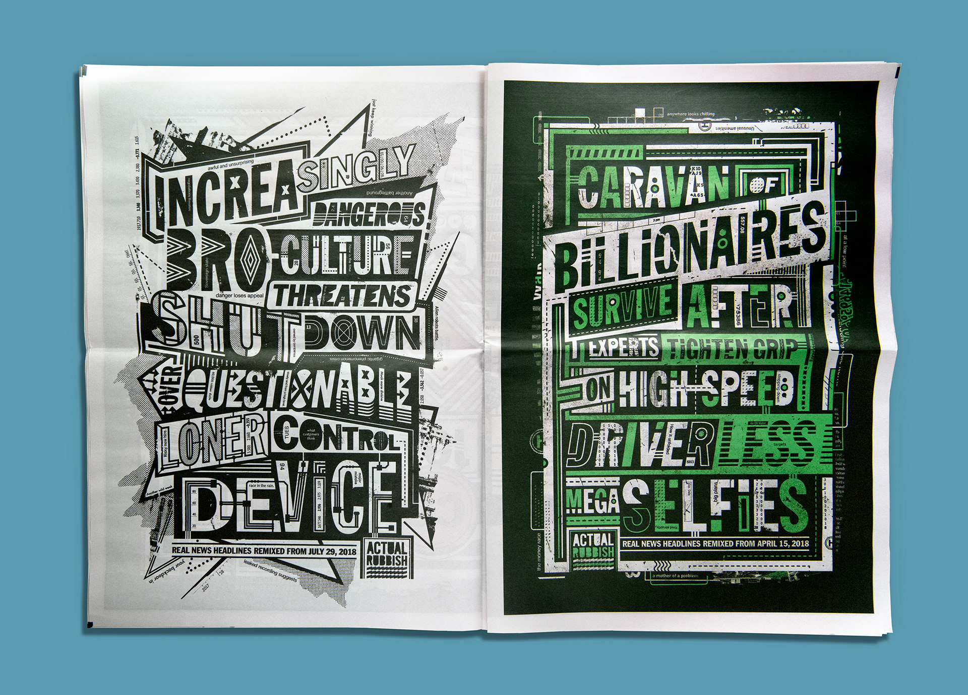
Brief- “Real News Headlines from 2018 Remixed”, as a result of unbelievable news and headlines the idea was to set out and make news and headlines even more unbelievable than usual, this design was created in order to show the insane next steps of the information we show and how insane it will become, as well as the chaotic visual manner that represents the information overload we experience daily.
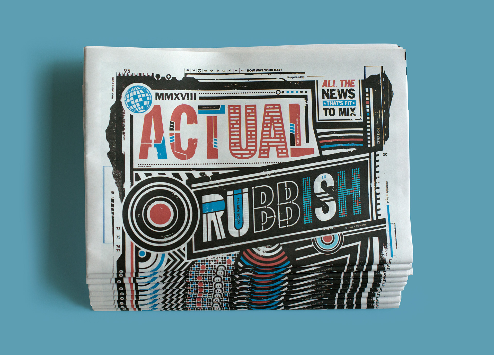
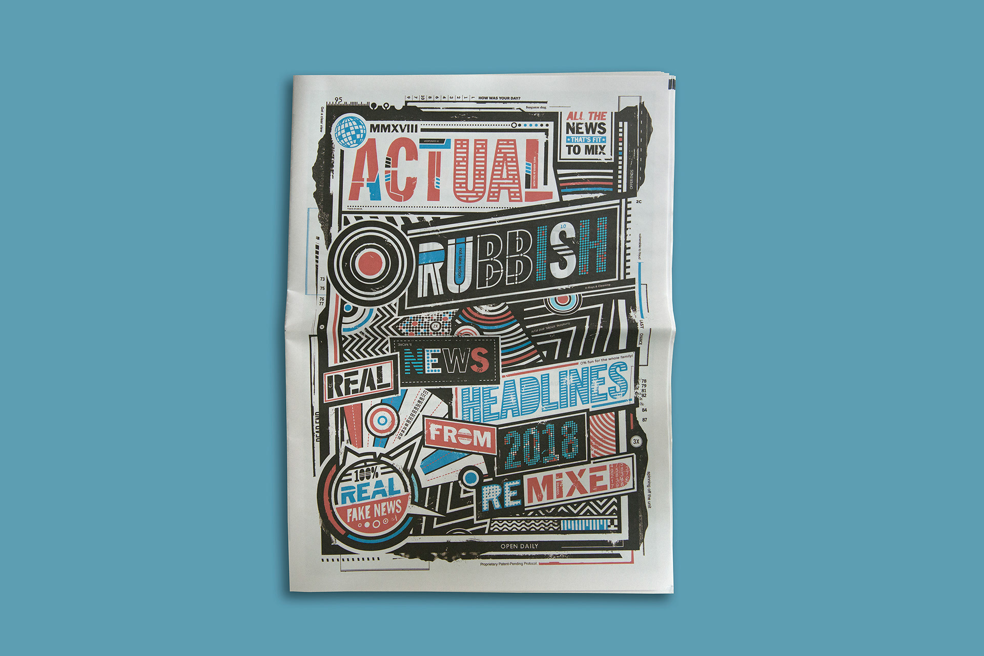
This work was used for being part of a fundraising project where additional proceeds would go towards the “freedom of press act”. The final 32 page document could be bought online and each page had its own memorable news stories facing the page at that moment in time. The typeface consists of multiple variants of types used either in standard newspapers or digital fonts used such as twitter or apps.

The great thing about this design is the cause, it exists throughout every page and whilst not as subtle as the equal pay one, it showcases the fear of the creator combined with the chaos of the stories informing the reader. The best form of this ideas is the “caravan of billionaires” one, which is the most absurd but reflects society at its current point and amplifies it, to show the drastic consequences.

Despite not winning a pencil and only becoming a shortlisted, I feel it works best towards the research as the cause and reflection of it is shown throughout the paper, as well as raising money for the cause outside of the competitions. its use of strong type combined with mild imagery set in a hectic format best resembling the cause is all justified as well as questionably needed regardless of desired.

3- The Last Column

entrant- FF

pencil- Wood

brief- A memorial movement bringing attention to the cost of journalism centered around a book containing the last posts and stories of more than 20 murdered journalists.

The Last Column

Image result for The Last Column

Image result for The Last Column

This work was used for new York times best seller list as it pertained to include names from new York itself who was killed trying to bring information to light and as a result the death of them in the process. the cover and backing all contain 1,337 names of journalists who have all been killed in action by 1992.

The white space on the front cover is used as a representation of the 20 journalists who could no longer fill that space with work they have created, an emptiness of themselves as well as a constant reminder of the results of being a journalist. The names of the journalists are debossed into the book and the font is that of a typewriters font linked to the original way of newspapers and journalism.

The reason this deserved the wood pencil, is due to its ability to connect with people all around the world through the use of its message and style, its partnership with the “committee to protect journalists” only strengthens this. The use of font, blank space and layout is all justified with the original ways of journalism and celebrates their role in society and how they have influenced them and sacrificed their lives for us.

4- Mutilated Words

Entrant- Impact BBDO

Pencil- Wood

Brief- using typography and design to showcase genital mutilation and the different viewpoints/ perceptions on it.

Image result for Mutilated Words

Image result for Mutilated Words

Mutilated Words

This work was used in order to showcase how brutal and dehumanizing genital mutilation is for women and how some societies perceive it to be okay. The use of stitching much like the act itself is used as a representation of the end result and what people think of it, whilst the unstitched version is used to show what it should be and not what it is.

The paper itself has the texture and thickness of skin in order to create a stronger connection between the creator and the user, the use of blood red ink only strengthens the link between the victim and the creator and bridges the gap between understanding and realizing. The series of words used are in conjunction with the language the creator uses and how in his dialect the words are so similar they may be mistaken or used in other contexts.

I believe this is one of the cases where the use of paper, language and even ink colour has all been used to create and show off the idea of mutilation in a much more brutal realistic shock factor tone. This would be something to take into account as every single detail is used in a way somebody may not have attempted before.

5- BOMA

Entrant- Papanapa

Pencil- Shortlist

Brief- Rebrand of BOMA design and showcase how music has become overpowering, addictive and confusing.

BOMA

BMA-anima-portfolio_v3BMA-anima-portfolio_v3BMA-anima-portfolio_v3BMA_behance_v4-04

BMA_behance_v4-01

The use of simple type font combined with overpowering animations and visuals amplifies the core meaning of the brand. It knows music has become part of day to day life and highlights this whilst show the effect it has on both the body and the mind. The brands type uses simple letters with increased arches in order to form the new type and repetitive segments of letters in order to show the repetition of both music and the effect music has.

The use of black and white is homage to the earlier forms of music where albums and posters only used black and white in the colour/ printing process. its use of simplicity does not take away the power form the type and helps even more with the imagery in order to create a stronger connection within the brand.

The basis behind what music genre it is, is that of electronic music, making the continuous use of animation and moving imagery as well somewhat flowing type in certain areas all fit in with that genre. One criticism I could make would be that the initial font minus some changes feels very simple and perhaps they could have expanded on this a bit more as it feels very vogue like. The use of animation would be something to think of as part of the final outcomes as to fit in with the concept as a whole as well as alternate ideas for ephemera should ideas such as a t-shirt become useless or too simple for a complex idea.