Criticality- Fixed part 3

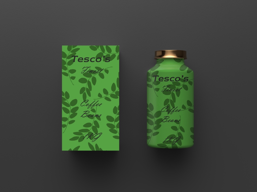
For this part of the project I wanted to use the coffee bean idea which was spoken during feedback in order to improve this. I wanted to use the leave aspect plus the green colours in order to give it a deeper feel with the embossing and foiling. I found out in comparison to the “lower” quality coffee I was trying to make that in fact this part was better and actually had more of a professional minimalist feel. I felt this was good as it separated the work more and helped with allowing the person to actually have a choice here as I felt I was often taking away. If you was to put the lower quality to the higher quality one then the lower seems somewhat better. This was a happy accident in my work and one I was proud to both voice and use.

Copper Foil Bottle Packaging Mockup by Anthony Boyd Graphics

Copper Foil Bottle Packaging Mockup by Anthony Boyd Graphics

Criticality- Fixed part 2

For this part of the project I wanted to show a very high end (£200 per bottle), bottle of perfume against a Tesco value brand form instead. I found the use of black and white to be similar to the original forms of this bottle but with the lack of logo, bold name and sleek design it makes it look very low or even own brand. The Tesco form I wanted to use roses and make it seem like it was designed by them. The use of background colors also helped give the piece a better feel and to create a bigger distance of gap between the two. By doing so it means I can break apart the works as well as give choice to the viewers/ buyers in order for them to see how it would all work in real life scenarios.

tesco box 2

bottle 2


Criticality- Fixed Part 1

Following the feedback from the hand in I felt that I had to fix the bottle and instead take a £300 bottle and give it a cheap look and feel, making it so that people would not take it and instead take the tesco version instead. Using newlook in conjunction with vladamir script made it so that the richer form with blacks and gold instead held better value than the grey, lifeless bottle that used times new roman. The use of colours and embossing helped create a distinction between the two. I feel the tesco version is better yet the Dom bottle seems to work somewhat nicely as well. Perhaps this is due to how the work is shown and seen or perhaps it is due to how it was used. Either way I am glad with how things were progressing and now I need to select my next products to test this theme on.

bottle 1

bottle 3

Criticality- Feedback

The feedback for this project was that of using a much more higher quality mock ups, better theme in relation to them all, use of better fonts, as well as embossing or materials needed for this should be highlighted more. The use of foil while liked could be celebrated more and the leaves seem less applicable to beans and more towards coffee which would be a better route to go down. Aside from this I should also create a much more distinct comparison between the two and see how it is showcased throughout.

Overall feedback was pleasant and something I agreed with. Nothing was too harsh and changes seemed minimal and simple enough to do. This has also allowed me to perceive items differently so perhaps there is also that to take away from this part of the course. It would also be nice to possibly undo all of the preconceptions with class and with idea, tame them and make them more accessible and comfortable to all.

Criticality- Presentation

criticality pres

My presentation consisted of my work and a rough physical mock up that I had made in order to show my work more and give a better understanding of it all. The use of foil seems to be better for a visual and help show my work. However it also seems somewhat out of place and would instead be something that I would use for larger scale mock ups or even digitally. Feedback from peers was liked in terms of the box and foil and will something that I perhaps use in future projects should I ever need to. I like the idea of where I was going but I do not feel as though it was something I was giving enough credit for or using to the fullest extent. With that will come improvements and a much more tight concept that uses my work more as well as the theme. Overall I wish my project was easier to understand but seeing the difficulty of it I think I did the best I could having no experience in this field whatsoever.

Criticality- Outcomes 2

Using this net design combined with a mock up I was able to create the other final pieces towards my presentation. By changing the colours I am able to see which ones work the best and which ones do not. I have ended up settling for a simple orange and green for the beans as I feel this is what is best suited and does not require me to be as wacky as I need to be. Especially with the end result it needs to resemble a bean tin and I feel that it does. I do wish however I was more experimental with the design and layout and used a better pattern but when presented with the original in comparison I think it will be easier to see which is which and what I am attempting to convey. Whether or not I actually remain using these ideas, it will be left for feedback but for now it is much more applicable to my work and how it allows me to see items within shops as well as speaking to fellow colleagues and seeing how the use say ear pods in comparison to normal earphones that cost roughly 1/10 as much. I should probably get there feedback when I end up presenting my work to see how their mindset work in relation to this and whether or not other reasons are why it does/ does not.

bean packaging

box 1

can 1

Criticality- Outcomes 1

bottle 0-5

For the final work I wanted to include a bottle mock up which used basic designs and type to barely advertise it yet also show what type of drink it is and how it actually has quality towards it. As well as this I also wanted to use some colour to see if it could give it some life towards it, however I am now thinking this was in fact a bad idea and should have gone lifeless instead. I am however liking how simple it looks and the idea of changing class with products seem to work the best here. perhaps it is the mock up itself that helps this or perhaps it is in fact the idea it simple enough that it could be considered a stand alone idea that does not require as much exploration as most. I will have this piece showing next to the original to showcase the quality change and how in fact it is now seen and understood by others. Hopefully the feeling of disgust will hit us and therefore expand and extend what I am trying to communicate to the viewer.

Criticality- Introduction

For me criticality means exploring a problem or issue that has not be tackled/ solved yet and instead finding a way to go about it. Following my dissertation work this idea of aesthetics and practicality and how it can all be challenged is something I enjoy and was something that I wished to do. I can use criticality to perform a stance or objection as to how it all seems to work and how it shows itself towards the design industry. I can question and challenge societal norms as well as creating a form of awareness for other people and ourselves as a society. I can also look at how we project ourselves onto products and in reflection of them selecting us, we also show our wants, needs and desires but are they even really needed/ wanted or is it just something we tell ourselves to justify it? Either way I want to dive further into this topic and see how I can use it to better the practice and graphic field to some extent.